
In 1967, Canada celebrated its 100th anniversary. This was celebrated in many ways, including the production of a special penny, and a Confederation train that traversed the country, but one way was relevant to this site: the Centennial logos.
The Centennial logo was designed by Stuart Ash, and is a stylized Maple leaf composed of 11 coloured triangles – one for each province and one for the Northwest Territories. At the time the Yukon Territories and Nunavut did not exist.
The logo was one of the first applications of the maple leaf to represent Canada, and was reproduced in many ways during 1967.
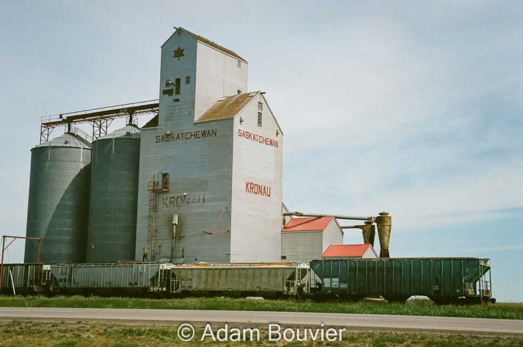
The Saskatchewan Wheat Pool decided to apply the Centennial logo to the cupola of several of its grain elevators.
The towns that still have grain elevators that bear the Centennial logo are:
In the intervening 50+ years, the elements have worn the colours off the logos, but the basic shape remains.
Other towns that had grain elevators with the Centennial logo include: Hodgeville.
Comments
One response to “Centennial Logos”
[…] the 1867-1967 Centennial logo on the elevator. There are only a few remaining with the logo. I saw it on one of the two […]